


Studio Akemi designed a visual identity for Central Standard, an original short documentary series co-produced by Scrappers Film Group, PBS Digital Studios, and Chicago's WTTW. This visual identity encompassed internal designs for the show such as the opening sequence and titles and external designs for marketing and distribution.
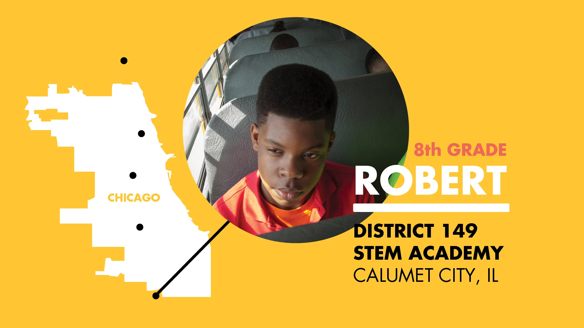
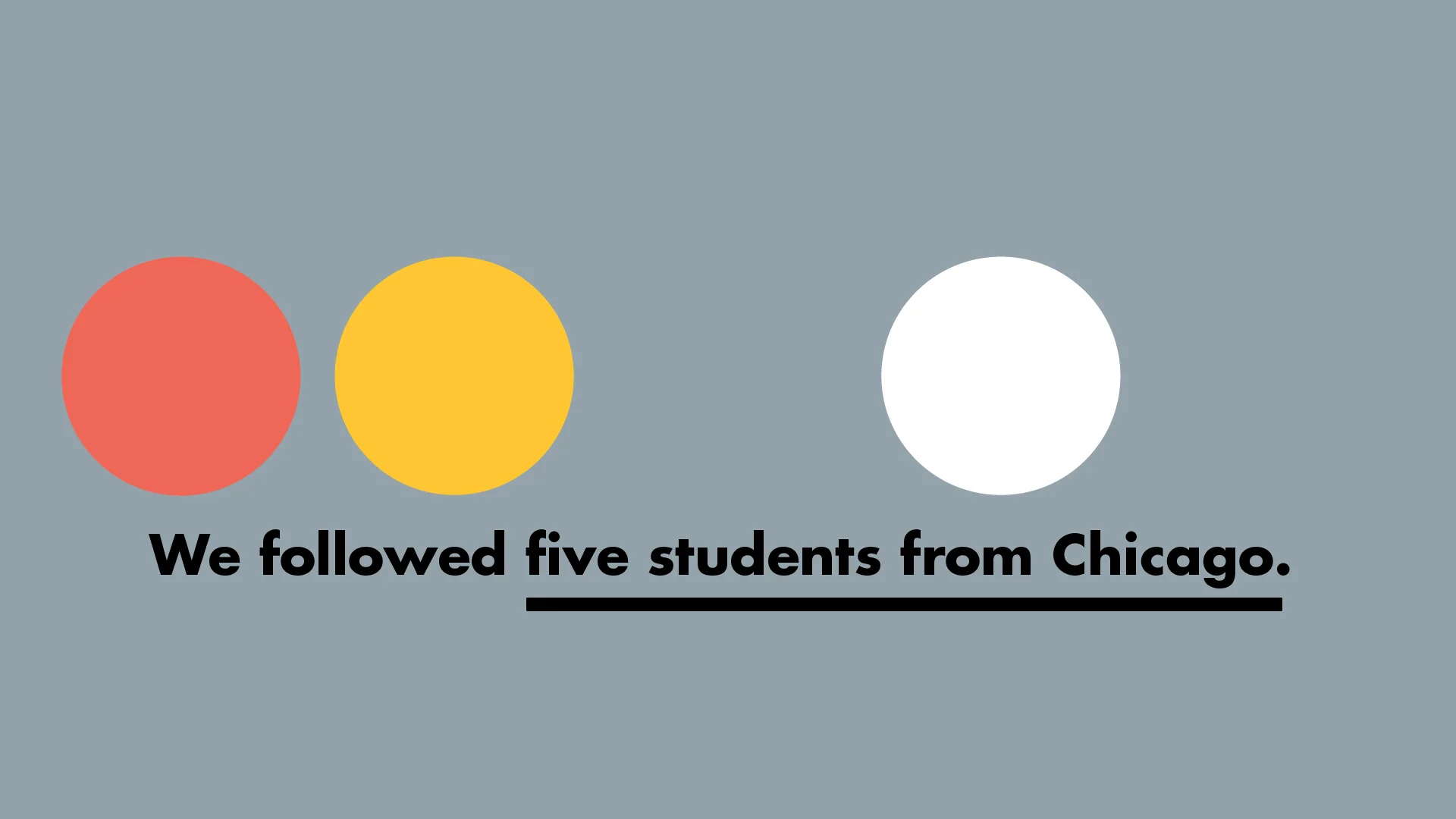
The show focuses on education, as seen through the eyes of five 8th grade students at very different publicly-funded schools across Chicagoland. It launched April 14, 2014 on YouTube and premiered on television in Fall 2014.
The look and feel of the visual identity stemmed from Chicago's history as a railroad epicenter for the entire country. Every train that travels across the country had to past through the Chicago rail yards. That plus a sense of institutional time (no matter if you're in school, working in a local government office, or minding a patient, your routine is bracketed into time blocks) pushed the visual identity to evolve from the specificity of railroad train graphics to the universal clock face. Studio Akemi used the yellow, pink, black, and gray colors from the No. 2 pencil and children's school bus for the color palette.
Studio Akemi also designed interactive materials that engaged the show's content for a Chicago Cares workshop.